Task Switcher
- Contributors
A necessary part of any OS interface is the task switcher, without it, users would only be able to work within one application at a time. The task switcher is a key component for increased productivity.
Typical Appearance
The task switcher can come in many forms, and is very dependent on the system, but there are three main appearances which exist on modern desktop OS’s . The first, and most important, is the task bar, or tray. This is a list of pictures of each application, which is always on the bottom or side or the screen. Each picture can be clicked on to toggle that task being opened or hidden, and often users can alternate click on the tasks to open up a menu with additional options, including ending tasks. The second common appearance is a feature that portrays all currently open programs (or their respective icons) in thumbnails across the screen. They typically prioritize the screen, displaying themselves in front of any and all open windows. Please click here to see examples on different operating systems. Most systems also have a third window that gives more technical information on tasks. This is called Task Manager on Windows and Activity Monitor on Mac. This window can usually be opened with a keyboard shortcut and gives performance and resource usage information on individual tasks. Tasks can be terminated from this window, including tasks that are not responding and cannot be closed normally. Please click here to see examples on different operating systems.
Example of a desktop task switcher (Windows 10)

Typical Behavior
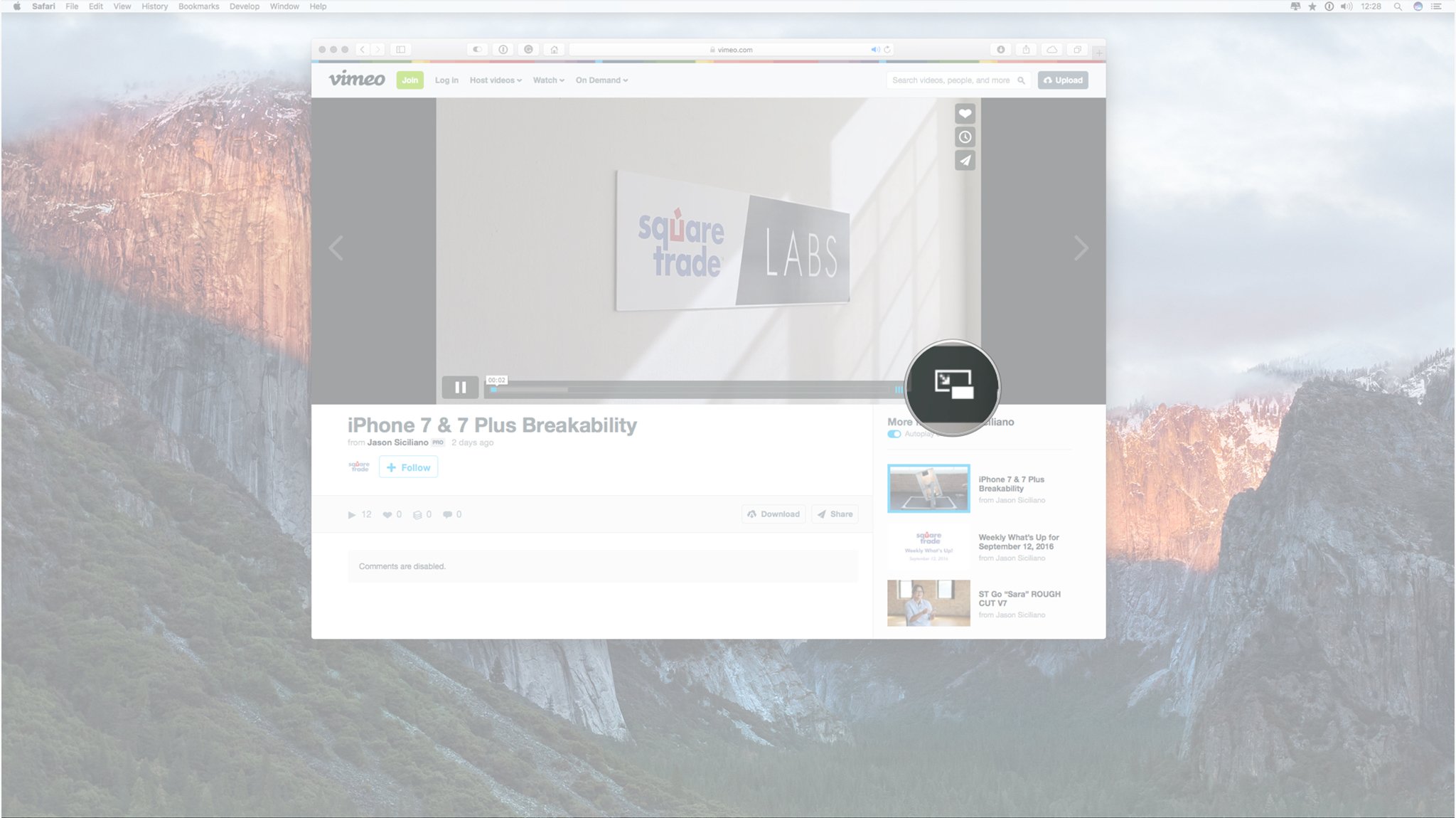
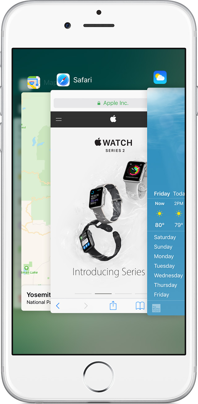
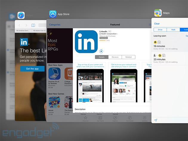
A fairly common way to use the task switcher is through a hot key that would bring up all the applications that are currently running. The specifics of this vary by system, but the hotkey is often good for switching between two Windows, or other tasks using the keyboard only and not the mouse. After using the hot key, you simply click on which application you would like to switch to. An example of this would be pressing ALT+Tab in windows, which would bring up the apps in that grid like structure that is shown on the Windows 10 example in the “Typical Appearance” section. In the older versions of iOS, double tapping the home button would reveal a task bar on the bottom of the screen. In the more recent versions of iOS, double tapping the home button would reveal the applications in a single row where you can swipe left and right to see which applications are running. From there, you would simply tap which application you would want to switch to. Below is a video showing off the task switcher in OSX. The taskbar pops up, taking priority of the screen, and the user can navigate to the left or to the right, quit tasks, hide them, or quickly "alt/tab" back and forth between a pair of tasks.
Component In Action
Below is a video showing off the task switcher in OSX. The taskbar pops up, taking priority of the screen, and the user can navigate to the left or to the right, quit tasks, hide them, or quickly "alt/tab" back and forth between a pair of tasks.Events
There are only a few simple events when talking about Task Switcher. The most relevant, basic task launcher event is to select the new open app and switch to it. Because switching between applications is a fairly simple action that is heavily used, it should not require the user to perform many steps. First of all, the task switcher is either onscreen or offscreen. If a user hovers over a task, it becomes selected. The previous task then becomes unselected since only one task can be selected at a time hence task switcher.
Variants
Switching tasks is a standard operation on most devices. Below is a list illustrating the broad ways to accomplish task switching:
- Mission Control, an OSX variant, displays all open windows in thumbnail view across the screen. The difference is that there are no shortcuts to navigate between currently open windows, and you get a preview of the conent of each open task, rather than just the task icon. They are not aligned neatly across the middle of the screen, but scattered. A user can click on any task to switch to it. Also Mac OS has a desktop switcher, which can switch between multiple virtual populated desktops, instead of individual tasks. More information can be found in Platform-Specific Instances.
- Most smartphones have a task switcher. When launched, gesture-based controls allows the user to cycle through all open apps, and when they find the one they want to open, they tap on it to open it. Also it is important to mention that task switchers on mobile OS’s are very different for each platform, and do not look the same as on desktops.
- Using Voice Navigation (i.e. Siri) and vocally ask to "open" a specific task.
Priority Metrics
Its main function of switching tasks should be intuitive. Once the task switcher is active, there should be no confusion and no series of extra steps to accomplish switching to a different task. While switching tasks is relatively straightforward, the task switcher hotkey is more difficult to learn. Firstly, the user may not even know that this method exists, and if he/she does, must first discover the hotkey. Even then it takes a bit to get used to the single button control, and the user will likely take a few tries to switch the wanted task. The task manager is a bit more complicated as it shows more detailed statistics and information, which the user may not understand. There is also the same issue of finding how to get to the task switcher in the first place. However, the most common use of the task manager, force ending a task, is fairly easy to learn, as there is usually an obvious button. Learnability is important, but assuming a user will be using any given OS multiple times, learnability is only an issue at the outset and is not as important as efficiency, which will always be a concern.
All three versions of task switchers should be very efficient. There are little to no intermediate states between the user and his/her goal. That being said, each of the three versions is more efficient for different things. The task bar is the generally most efficient as it is always on screen (if not auto-hidden) and shows all tasks in one view. The hotkey is most efficient for switching back and forth between two tasks, and is also the best solution to switching out of a full screen application, where the taskbar is hidden. The task manager is not very efficient at switching tasks, neither is it the most efficient at closing tasks, because it takes time to come up and navigate to the wanted task, however it is the most powerful, and must be used when the other methods are not working. Because the task switcher is so often used, efficiency is the most important metric.
The taskbar should have few errors, as it is fairly simple. However, users could often accidentally open a pinned task by misclicking, or accidentally close or switch away from a task they want open. The hot key has the error or hitting the key too many or few times, and therefore switching to the wrong task. The task manager takes more effort to open and I cannot think of any regularly occurring errors. Errors are definitely a concern for any given task switcher. Each common error is a decrease in overall productivity.
Memorability would be the biggest hurdle, as users need to memorize the input to launch it. Once that one input is memorized, there should not be any confusion on what to do next. All three versions of the task switcher should be easy to remember. They are all fairly simple mechanisms, and they always function the same no matter what or how many tasks are open.
If any usability metric is least important for a task switcher, it is probably satisfaction. The action of switching a task speaks for itself and there is little need for feedback other than to do its job quickly and efficiently. The user should feel that switching tasks is effortless, and feel a sense of "flow" as they are hopping between tasks. If the other metrics are satisfied for any given task switcher, satisfaction will follow.
Key Characteristics
I think the most important IxD principles every task switcher should adopt are Efficiency, Feedback, and Simplicity.
Efficiency – A good task switcher should prioritize efficiency and should be accessible from any screen or application. It should have the ability to switch between, or kill tasks in 1 or 2 steps since task switching is a heavily used action. Common task switcher features include representations of the running tasks, icons for example, and a button to quit them. The user should be able to switch to any given task with as few clicks as possible, and the switching action should be a quick process without any unnecessary transitions or animations. Switching tasks should be a simple, easy to learn task, and should function the same regardless of how many or what type of tasks are active.
Feedback – Feedback is a very important IxD principle that a task switcher must adopt. Users should never be doubtful of these two scenarios: 1: a current task is highlighted, and ready to be opened on key release 2: all other tasks are not selected, so as there is no confusion as to which task will be opened Should these scenarios be inconsistent and the task switcher deems unreliable, the user will require much more time when attempting to switch tasks due to uncertainty in his interface’s function.
Simplicity – Simplicity is also an important IxD principle to implement in task switcher. Users should have zero problems distinguishing which tasks are active, which task is currently selected, how to select a different task, and how to quit a running task.
State Diagram

Keeping in mind that only one task can be selected at a time; Task switcher states depend on the functionality of the switcher. As a general overview, we can say that there are only 5 different states: Task not running, Task running and active, Task running and non-active, Task selected in task switcher, and Task options panel selected in task switcher. A task must be selected in order for it to be launched, which occurs on key release or it’s platform-specific way selection. However, if the task switcher is active onscreen, a user has the option to interact with each task, but they are never disabled if the task launcher is open. It is important to remember that in the taskbar/tray, tasks not currently running can still be selected, open, or shown options.


