Radio Button
- Contributors
A button whose function is making a choice out of a selection of choices. The focus of a radio button is on the exclusivity of the selected response. When pressed the button is set to active and every other button in the set is set to inactive.
Typical Appearance
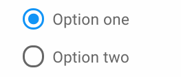
Radio buttons are usually circular in appearance and are accompanied with a text label on the right that describes the given option. They are often accompanied with a series of other radio buttons of which the user can select one in response to a given choice (ex: The question "What is your favorite color?" with the radio buttons being an assortment of different colors).
When inactive, the circles are not colored in, giving it an "empty" look to suggest that it is not currently active. When active, a dot concentric to the circle or an entirely different color to the background color of an empty button "fills" the circle, indicating that it is currently chosen.
Typical Behavior
Just like with a general button, a radio button's behavior is solely dependent on whether the user has pressed/toggled it or not. This is usually done via the pointer/cursor but can also be done with keyboard inputs.
The active/inactive state of a radio button is dependent on the active/inactive state of the other related radio buttons. The active state is exclusive to one radio button in a set at a time (i.e. two radio buttons cannot be active simultaneously).
Disabled buttons have their circle and/or corresponding text grayed out.
When accessing via keyboard inputs using the tab button, a radio button is surrounded by a dotted square or border to indicate that it is currently in selection.
Events
Hover
When the pointer/cursor is within the area of the circle. In this case, radio buttons either do nothing, or give the user feedback (i.e. cast a shadow within the circle) to indicate that it is ready to be interacted with.
Selected
Occurs strictly when user is operating through keyboards input. Pressing the tab key scrolls through all the optional clickables and since radio buttons are grouped together they are always considered one element. To scroll through the choices of radio buttons, the user must use the directional buttons on the keyboard (up and down).
Click and Hold
A user can click on a radio button (pressing within the vicinity of the circle or the label) and prevent it from being toggled by dragging and releasing the cursor away from the vicinity of the cursor. This event cannot occur using keyboard inputs.
Click and Release
A user can press within the vicinity of the circle or the label and immediately release it to toggle the button. In the context of keyboard inputs, once a button is selected, pressing the enter key is the equivalent of clicking it with a cursor.
Disabled
A disabled button provides no response when it is clicked on. Everything remains the same indicating to the user that nothing has changed. Sometimes a cancel icon takes the place of the cursor indicating that it cannot be clicked.
State Diagram

Component in Action
Pictured above is a depiction of a user picking between two radio buttons in a constant loop between inactive, click and active. As you can see buttons can be toggled if labels are clicked as well. Pictured below is a live demonstration of a radio button as developed by Bootstrap.
Variants
Menu Items

List Selection

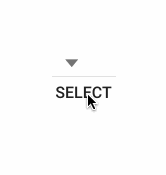
This variation presents itself as a list instead of circular buttons. Instead of "filling" in the circle to make a decision, the user clicks on the label itself (usually colored differently when hovered over). Another variation of this is the select box which is like the menu list but requires the user to press a separate select button in order to click their choice.
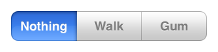
Segmented Control
Multiple Selectable

Priority Metrics
All metrics are important because radio buttons appear quite universally seeing as how interaction with user and system is constant. Presenting choices are often in the form of radio buttons.
Learnability and Memorability
Efficiency
Errors
Satisfaction
Key Characteristics
Radio buttons' metrics are entirely dependent on their aesthetics and the system's feedback to the user. So it is important that both of these are adjusted to provide the most error-free and least complicated process for the user.
Exclusive
An interesting feature, which can either be advantageous or detrimental depending on the argument, is that radio buttons cannot be rendered inactive ("turned off") without having to render another button active ("turned on"). This can be advantageous if the system absolutely requires the user to make a choice no matter what. But this can be detrimental if making a choice is not necessary and the user will have to reset the screen so as to clear the changes.
Interactive
Button should toggle upon clicking within the vicinity of the circle and the accompanying label itself.
Distinct
If there are multiple radio buttons in different categories in the same screen, they should be clearly separated in their respective groups with either a border, line break, or label. If necessary, they must be put into a separate screen.
Feedback
It should always be clear whether or not a button is in its active (true) state or not.
The toggling of both the button pressed and the button deactivated (if any) should be clear.
Every set of radio buttons should be clearly distinct from any other set.
On Actions
Press: The toggling of both the button pressed and the button deactivated (if any) should be clear.
Hover: It is up to the developer to give feedback when hovering, though the look of the hover should be distinct from active, inactive, and disabled.
Disabled: The button should be made to not stand out as much as enabled buttons. Additionally, the mouse cursor can change to more clearly show the disabled state.
Click: The button should show that it has been clicked, but not look as though it is in its active state.
Release: If released outside of the button, the radio button should remain inactive, and if released over the button then it should become active.
Platform Specific Instances
Radio buttons for this platform function similarly to the typical radio button. Its marked difference from previous OSX versions is its aesthetics. As seen from the picture below, the colors for the radio buttons are flatter and brighter with less highlighting and shadow, a brighter blue and more emphasis on white.

Microsoft sets some strict guidelines on the use of radio buttons. First and most importantly, radio buttons should only be used with two or mutually exclusive options. They should be used in the place of a drop down list when most or all of the options are important enough to take up screen space. In instances where the default option will be selected by the majority of users than you should use a drop-down menu instead. In general, there is not much difference between Windows 10 radio buttons and others, although Windows does make the choice to change the cursor to indicate hovering over the button as opposed to affecting the button itself.


In the GNOME Human Interaction Guidelines, a radio button is defined as, "Radio buttons are used in groups to select from a mutually exclusive set of options. Only one radio button within a group may be set at any one time. As with check boxes, do not use radio buttons to initiate actions." Notable things mentioned in the GNOME HIG for radio buttons include to place the radio buttons directly to the left of anything they are immediatley affecting, using sentence capatilization for the button labels, setting an access key in the label allowing for selection from keyboard, not to place more than eight radio buttons in the same grouping, and to align them vertically.
The GNOME Radio Buttons also includes a mixed state. This is used in situations when the radio buttons are in a multiselection grouping. Which, is against the idea of a radio button for most platforms.


These two images show examples of GNOME Radio Buttons, the left is found in the GNOME HIG and the right is found in the GTK+ API documentation. The model on the left has the current and modern design of GNOME included in GNOME 3 and includes a button in it's mixed state, where as the left is likely an example from GNOME 2.
Credits & References
- Page template: Paradixm Button Template
- Radio button in action GIF: Bootswatch
- Segmented control: Cowirrie
- Select button GIF: CSG Pro
- Keyboard inputs: Stack Overflow
- Radio buttons with multiple buttons clicked simultaneously: Apple Developer
- OSX10 comparison: Pixelapse
- Windows 10 comparison: Microsoft
- Other uncredited pictures belong to Janine Leano or Ryan Taus